Udemy Marketplace
Date
Location
San Francisco, CA
Role
Senior UX Designer / Design Lead for Mobile
The Challenge
The Udemy mobile app (iOS and Android) had very basic discovery experiences. The main navigation contained two categories, “Free” and “Paid”, which students could browse to see a list of courses. This setup worked as a way to validate if students were looking to enroll in courses through the mobile app. The company had since validated that there was an appetite to enroll in courses through the mobile app, and determined there was a need to provide students with more powerful discovery tools to help them find the right courses.
Goal: Empower students to reach their professional and personal goals by helping them enroll into the right course.
Helping Students Find the Right Course
To find out what students were looking for during their decisioning process, we first needed to understand their motivation. With feedback from students through interviews, support tickets, and market studies, we found that there were two main drivers for students to look for courses. The first case involved the need to fill a knowledge gap. This student needed to learn a particular subject or needed to take a specific course in order to fill that gap. The second case was more aspirational. These students were looking to add skills that may help them get to the next level, move into a new field, or to develop a new hobby. In both cases, there were two ways users sought to discovery courses – through search and browsing.

An example discovery and shopping flow that used simple illustrations to identify customer sentiments through the process. This helped identify where we should focus on relieving user painpoints.
Search
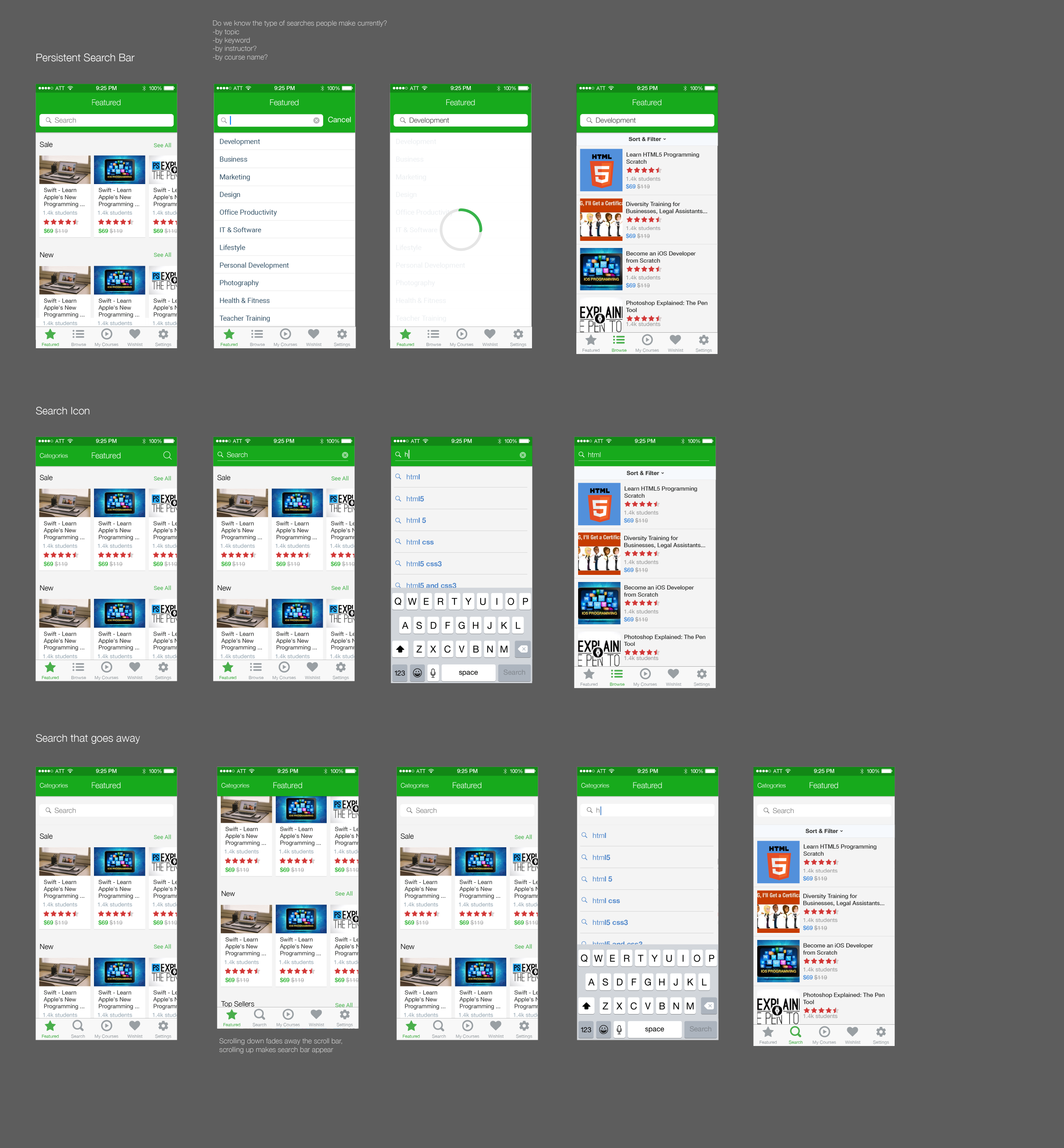
Through the Udemy website, we found that roughly 60% of students would perform a search if they knew which course they wanted, or knew the topic they needed a course in. While searching is a relatively standard feature or experience, there key decision was deciding where the search functionality would live within the app.
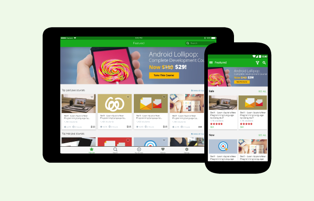
Explorations on different placements of search within the iOS mobile app,
There were a couple key drivers in determining location. The first is defining what a student could search. Would search be limited to simply the discovery of courses that a student was not currently enrolled within, or would it be more universal? For the initial scope, it was determined that students would simply be able to search for course titles they had not enrolled in, but there was a long-term desire to include the ability to search courses, instructors, notes (yet to be released), and sections or chapters within a course.
The second key driver was platform conventions. Because the Udemy app is available on both iOS and Android, would we seek to maintain a consistent UI across both platform, or intentionally have different experiences that followed their respective platforms’ conventions?
With these considerations in mind, it was ultimately determined that search would follow the platform conventions, as it would also address the first driver of being universally persistent on both platforms.
After determining location, there were a couple key opportunities to help students find the right course. One such opportunity was when a student would click into search. By displaying the top search terms on the search screen, we could shorten the students journey to a course. Another opportunity was on the search results page. By introducing filtering options, the student has more tools to narrow down to the course that’s right for them.
Just Browsing
For the majority of students coming into the mobile app, the browse experience is the main way they discover courses since the majority were first time users of the Udemy platform. The existing model of 3 categories was revamped based on business needs, the need to allow discovery for new users, and to provide tools that helped students narrow down their choices of courses.
In order to address all of the different cases, we first needed to define all of the requirements. From a business perspective, there was a need to advertise new/featured content, promotions, or well-known instructors. The second need was for a way to prominently display individual courses, whether they are new and notable courses, courses that are on sale, or courses that have been added to your wishlist. Lastly, we had to create discovery paths for new users to understand the breadth of Udemy’s offerings.
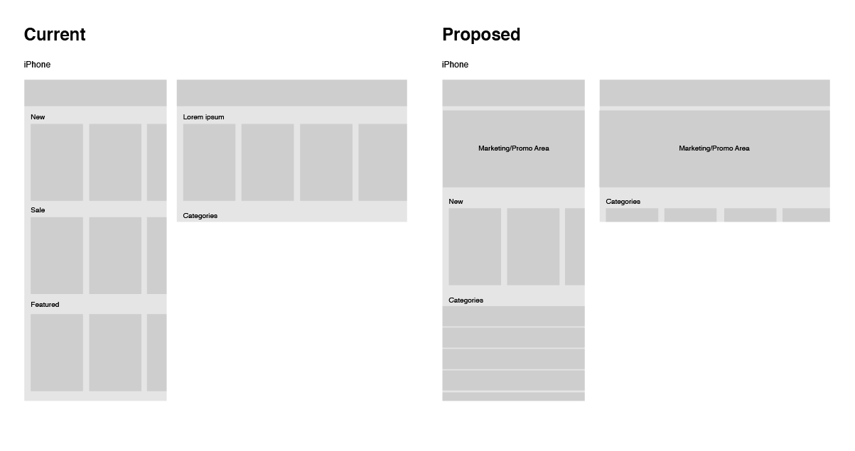
A wireframe used to illustrate the old layout vs the proposed layout.
To accommodate this, we introduced a new marketing promotion area that could display conditionally when promotions were active. Additionally, there was a section that allowed for a prominent display of individual courses. This section could support multiple carousels groupings of courses depending on what our content team’s needs, but there was a recommendation to limit to 2-3 groups to prevent pushing product categories too far down the screen. And finally, to bring continuity to the entire Udemy experience, we leveraged/. the categorization that was used on the web. This helped many new students understand the breadth of subjects available.
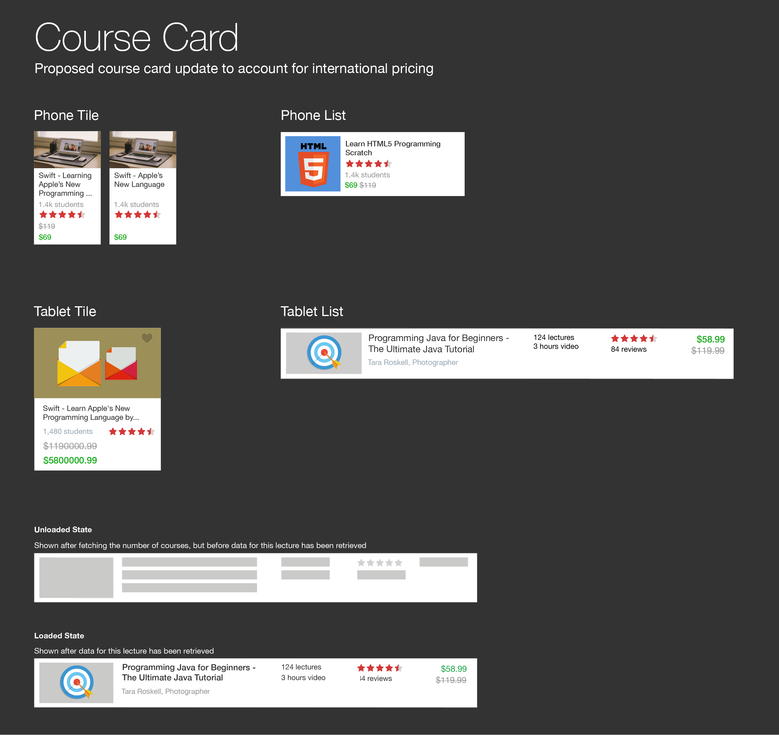
Working with the web team, we worked to standardize the course card to have the same look and feel on the web and mobile products. This ensured consistent data points between the two platforms and a more consistent experience for users that would shop on both the web and mobile applications. The one deviation on the mobile platform was around the size of the course cards, as a way to efficiently utilize screen real estate.
Additionally, since browsing through dozens of courses becomes a bit more tedious on a mobile device, the filtering system used in search was implemented here to provide more tools for finding the right course.
Navigation
With the addition of search and the ability to browse, we revisited the navigation to see how to organize sections of the app. We performed card-sorting exercises with several volunteers to see how they would group the sections of the app. We found that students overwhelmingly preferred a clear distinction between “my stuff” and “stuff I can get” (ownership vs non-ownership).
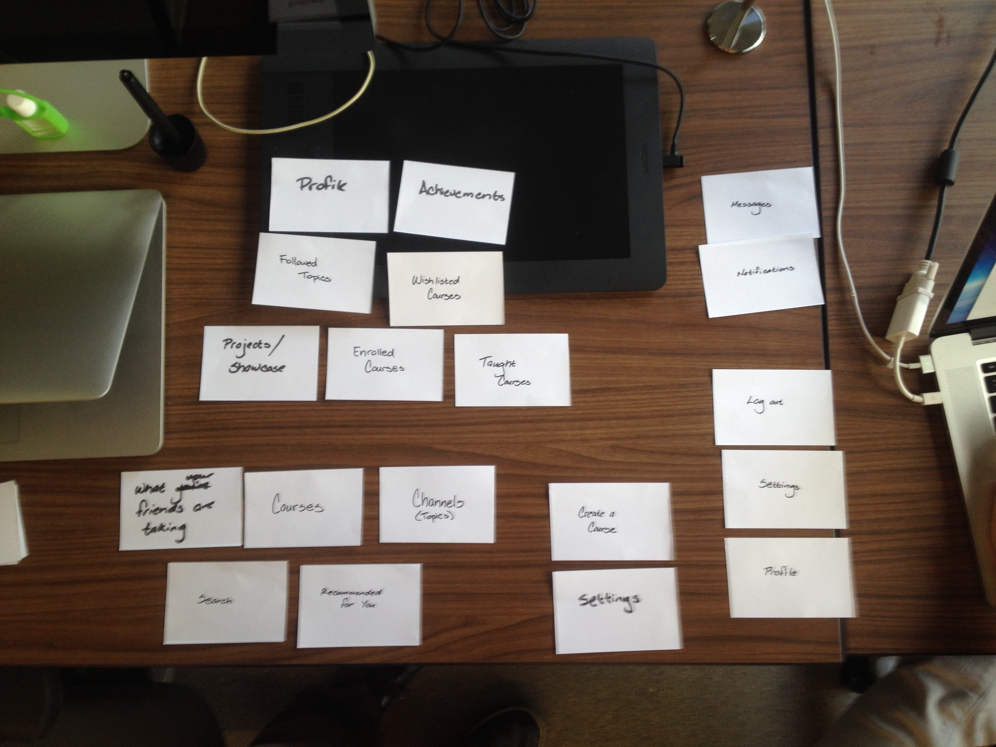
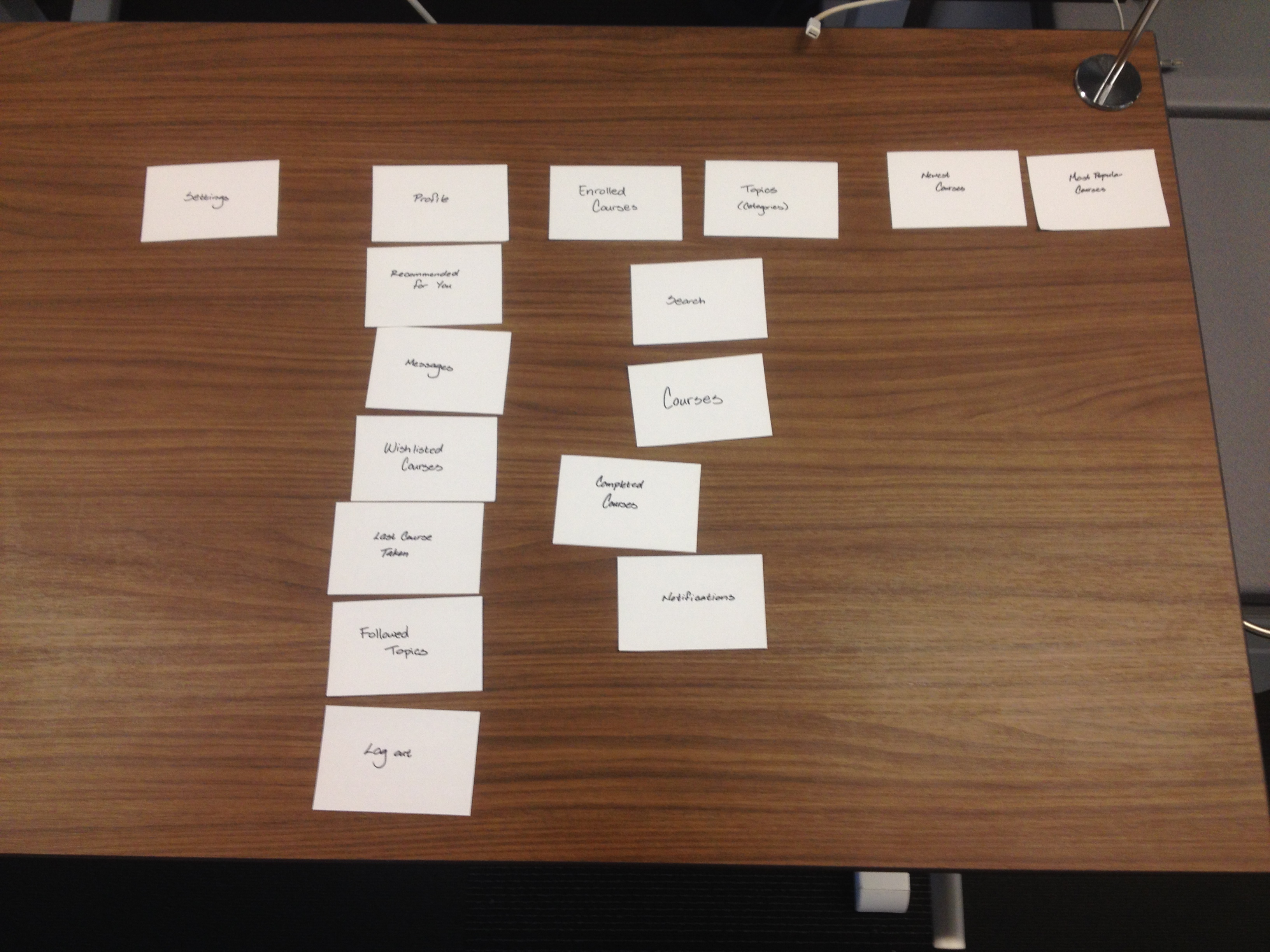
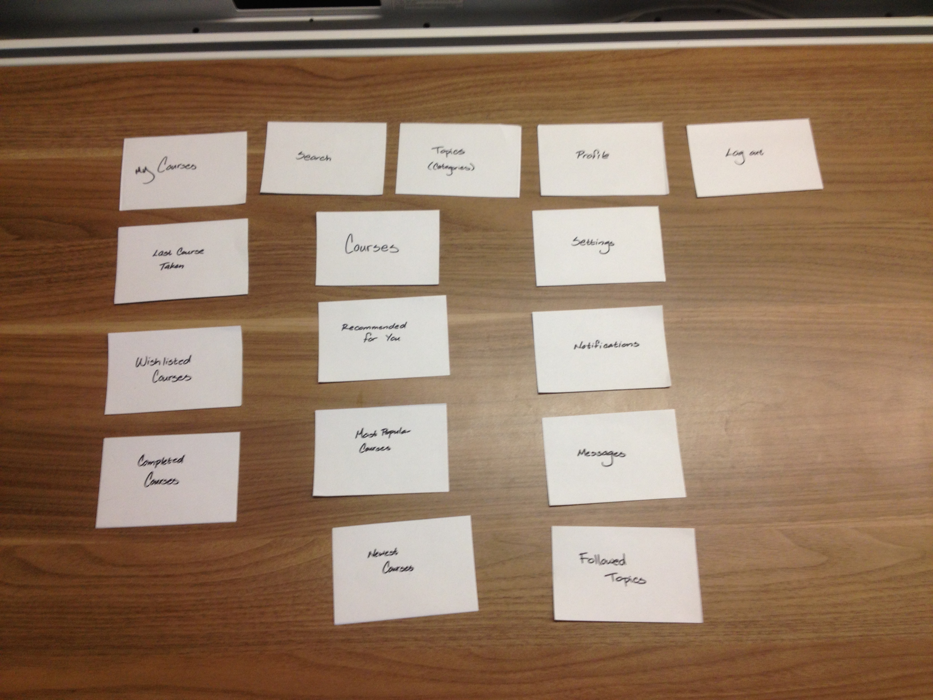
Card-sorting exercise We asked several volunteers to sort a set of cards in a way that made the most sense to them, using the fewest number of groups. A sample of results shown, which helped us determine the navigation.
From this, we designed a navigation that addressed both the needs of users and the needs of the business. We determined the categories that belonged in the navigation, and then worked on naming them and designing icons for them. After more informal testing with random subjects, we landed on a navigation system and adapted it to iOS and Android.
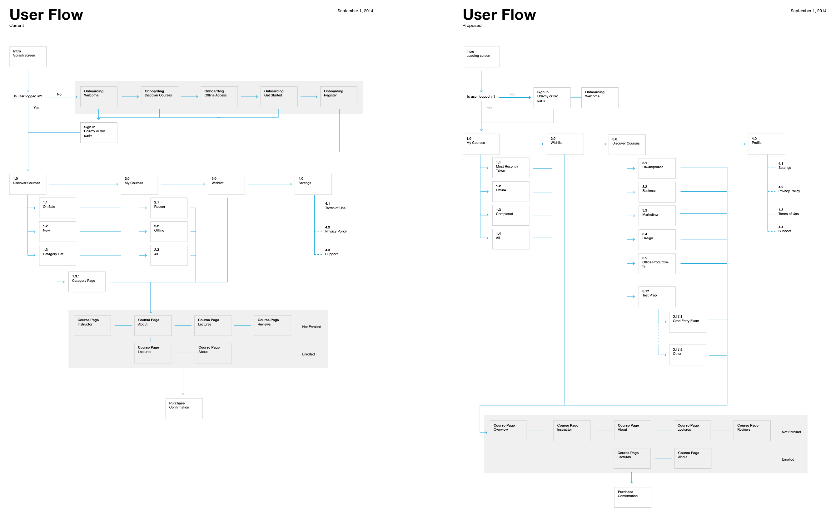
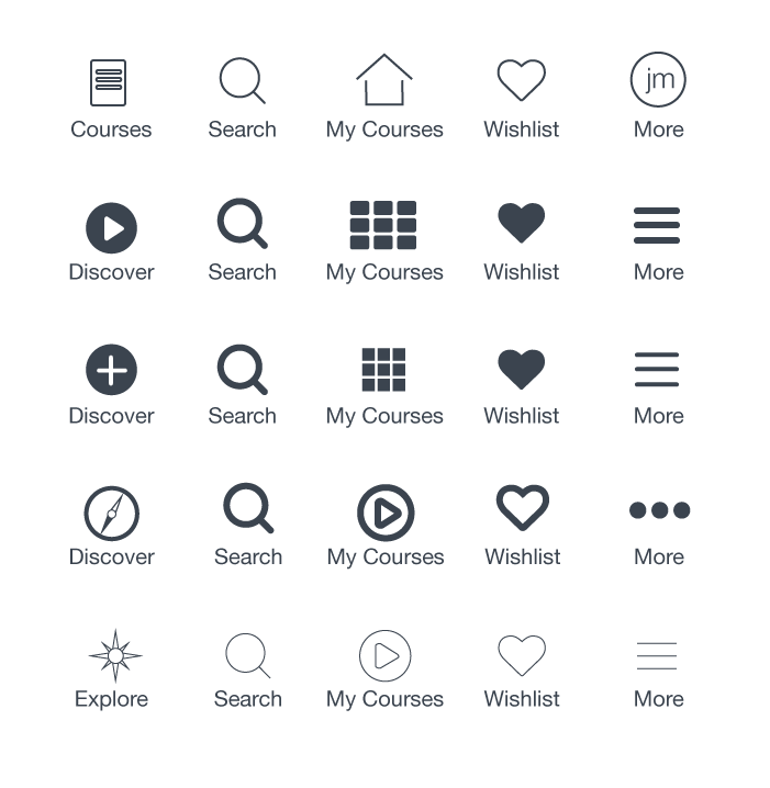
Top: A flow diagram show the old navigation architecture versus the proposed new navigation architecture. Bottom: Various explorations on possible names and iconography for the 5 top-level navigation items in the iOS app.
© 2020 Jonathan Monzon